
Choosing the perfect wall color can transform a house into a home, and few colors offer the versatility and timeless appeal of grey paint. For over a decade, as a WordPress blogger and SEO expert, I’ve seen firsthand how trends come and go, but grey remains a steadfast favorite. Its ability to serve as a sophisticated backdrop, a calming presence, or a bold statement makes it an invaluable tool in any interior designer’s arsenal. From the softest almost-whites to the deepest charcoal, the spectrum of grey is vast and often misunderstood. Many consider grey to be bland or uninspiring, but this couldn’t be further from the truth. The nuanced undertones – blue, green, purple, brown – are what give each shade its unique character and allow it to complement a wide range of décor styles and lighting conditions. Understanding these undertones is key to selecting the best grey paint colors for your specific space. This comprehensive guide will delve into the world of grey, dissecting its complexities and offering practical advice to help you navigate your options. We’ll explore various popular shades, discuss how to harmonise them with your existing furnishings, and answer common questions about this incredibly versatile hue. Prepare to discover the transformative power of grey and learn how to wield it to create spaces that are both beautiful and personal.
The impact of proper color selection extends beyond aesthetics; it influences mood, perceived space, and even the natural light within a room. A lighter grey paint can make a small room feel larger and more open, reflecting light and creating an airy atmosphere. Conversely, a darker shade can add depth and coziness, perfect for a snug living room or an elegant dining area. The context of your home, including its architectural style, the amount of natural light it receives, and your personal taste, all play crucial roles in determining the ideal grey. Instead of merely picking a trendy shade, we encourage you to consider the holistic effect you wish to achieve. Whether you are aiming for a minimalist Scandinavian look, a rustic farmhouse charm, or a sleek contemporary vibe, there is a grey out there waiting to bring your vision to life. This guide is designed to empower you with the knowledge and confidence to choose a grey that not only looks stunning but also feels right for your home and lifestyle. Let’s embark on this journey to uncover the endless possibilities that grey paint offers, transforming your living spaces one beautiful shade at a time. The right grey can truly elevate a room, providing a foundation for other colors and textures to shine, proving its enduring popularity is well-deserved.
Understanding the Nuances of Grey Paint Undertones
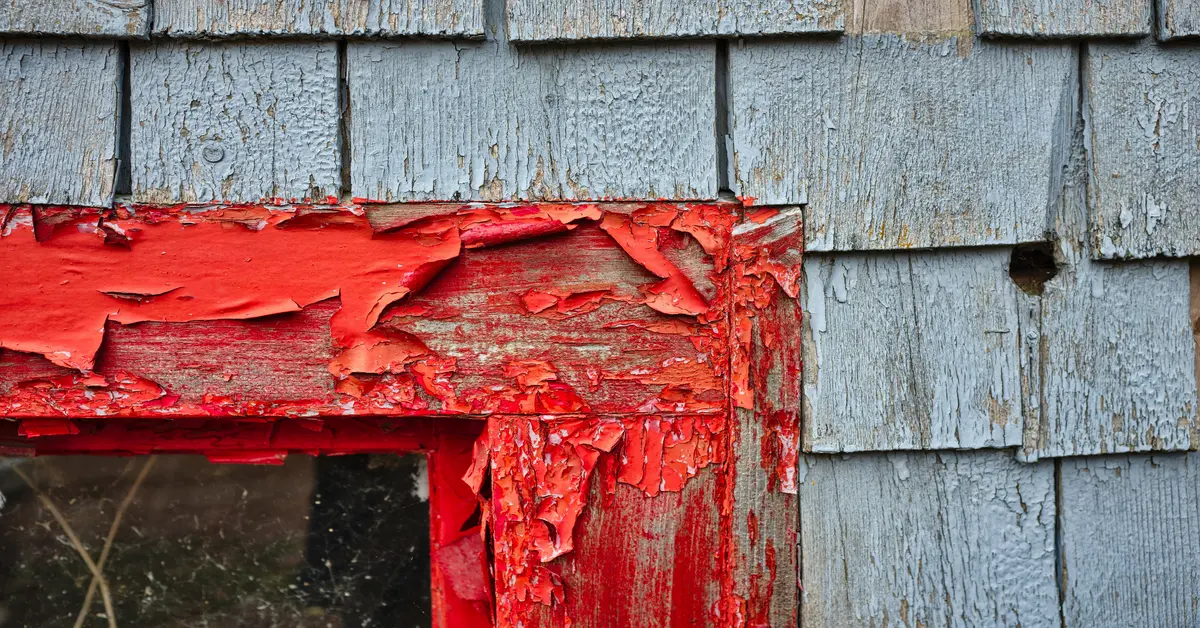
The secret to mastering grey paint lies in understanding its undertones. Many people choose a grey they love in a paint swatch, only to find it looks entirely different on their walls. This often boils down to the subtle colors hiding within the grey itself – typically blue, green, purple, or even brown (greige). These undertones become more apparent depending on the lighting in your room and the other colors present in your furnishings and décor. For instance, a grey with blue undertones might appear cooler and more calming, ideal for bedrooms or bathrooms where a serene atmosphere is desired. If your room receives a lot of warm, natural light, these blue undertones might be softened, appearing less dominant. Conversely, in a north-facing room with cooler light, the blueness will be accentuated, creating a crisp, almost ice-like effect.
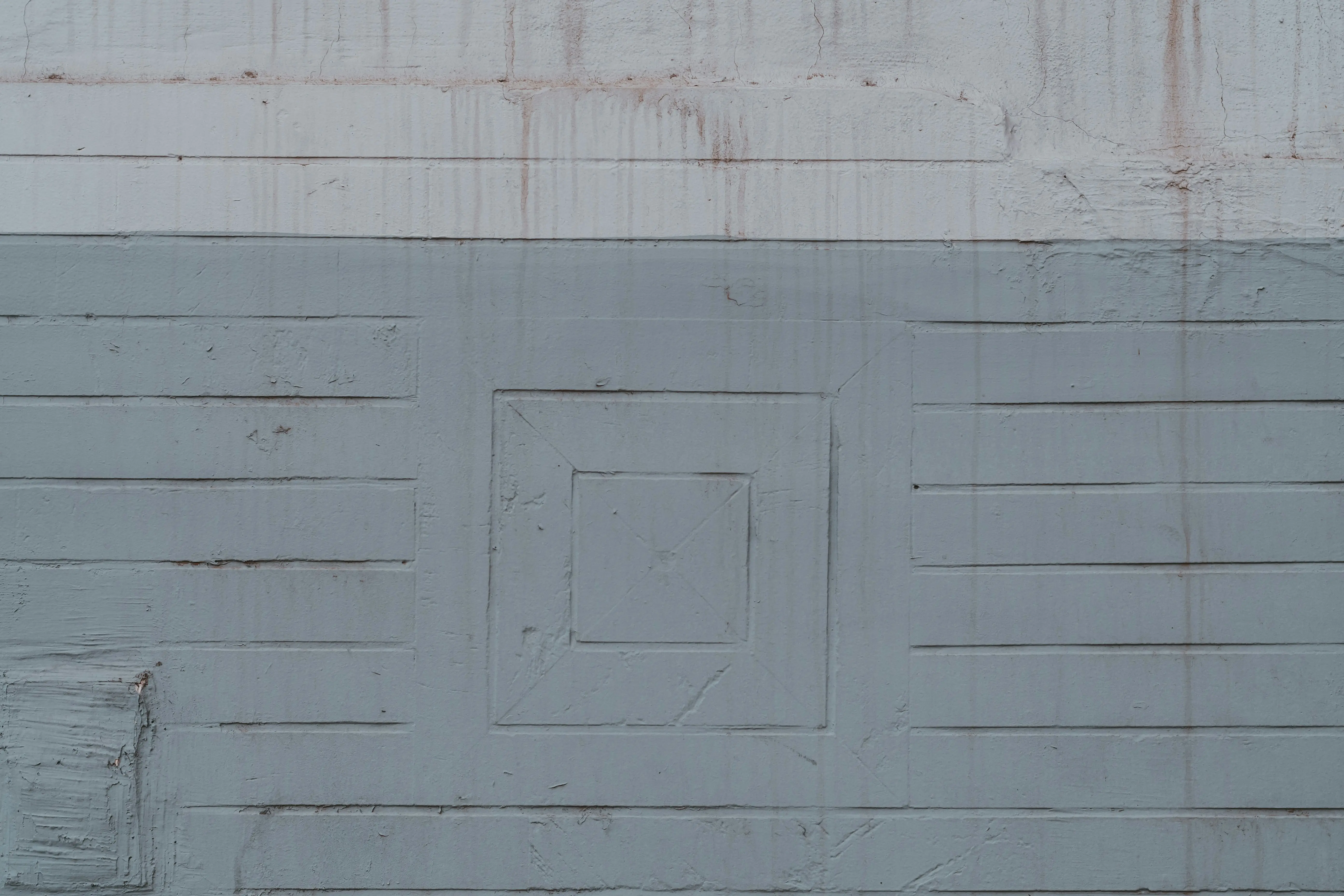
Green undertones in grey can introduce a sense of tranquility and connection to nature. These are excellent choices for spaces where you want to incorporate natural wood tones or plants, as the green harmonises beautifully with organic elements. Grey paints with green undertones often feel very balanced and can shift between warm and cool depending on the surrounding colors. They avoid the starkness some cool greys can have, offering a softer yet still sophisticated look. When considering the best grey paint colors, always observe how these undertones interact with your existing furniture, flooring, and decorative items. Even the color of your trim can influence how a grey appears. A bright white trim can make a grey look deeper and richer, while an off-white might soften its contrast. Testing large swatches on your walls is non-negotiable; observe them at different times of day and under various lighting conditions to truly grasp their full character.
Purple undertones in grey are less common but can add a truly luxurious and sophisticated feel. These greys tend to lean more towards the warmer side, creating a cozy and inviting atmosphere. They pair beautifully with rich textiles like velvet and can beautifully complement jewel-toned accents. However, it’s crucial to be mindful of how these purplish greys interact with existing pinks or reds in your décor, as they can sometimes amplify those tones in unexpected ways. Finally, greys with brown undertones, often called ‘greige,’ are incredibly popular for their warmth and versatility. They bridge the gap between grey and beige, offering the best of both worlds. Greige shades are fantastic for creating a soft, welcoming environment and work exceptionally well with natural materials and earthy palettes. They are often considered safest for those who are wary of overly cool greys. By truly understanding these inherent color leanings, you can confidently select a grey paint that not only looks stunning but also enhances the overall mood and aesthetic of your space.
Choosing the Right Grey Paint for Different Rooms
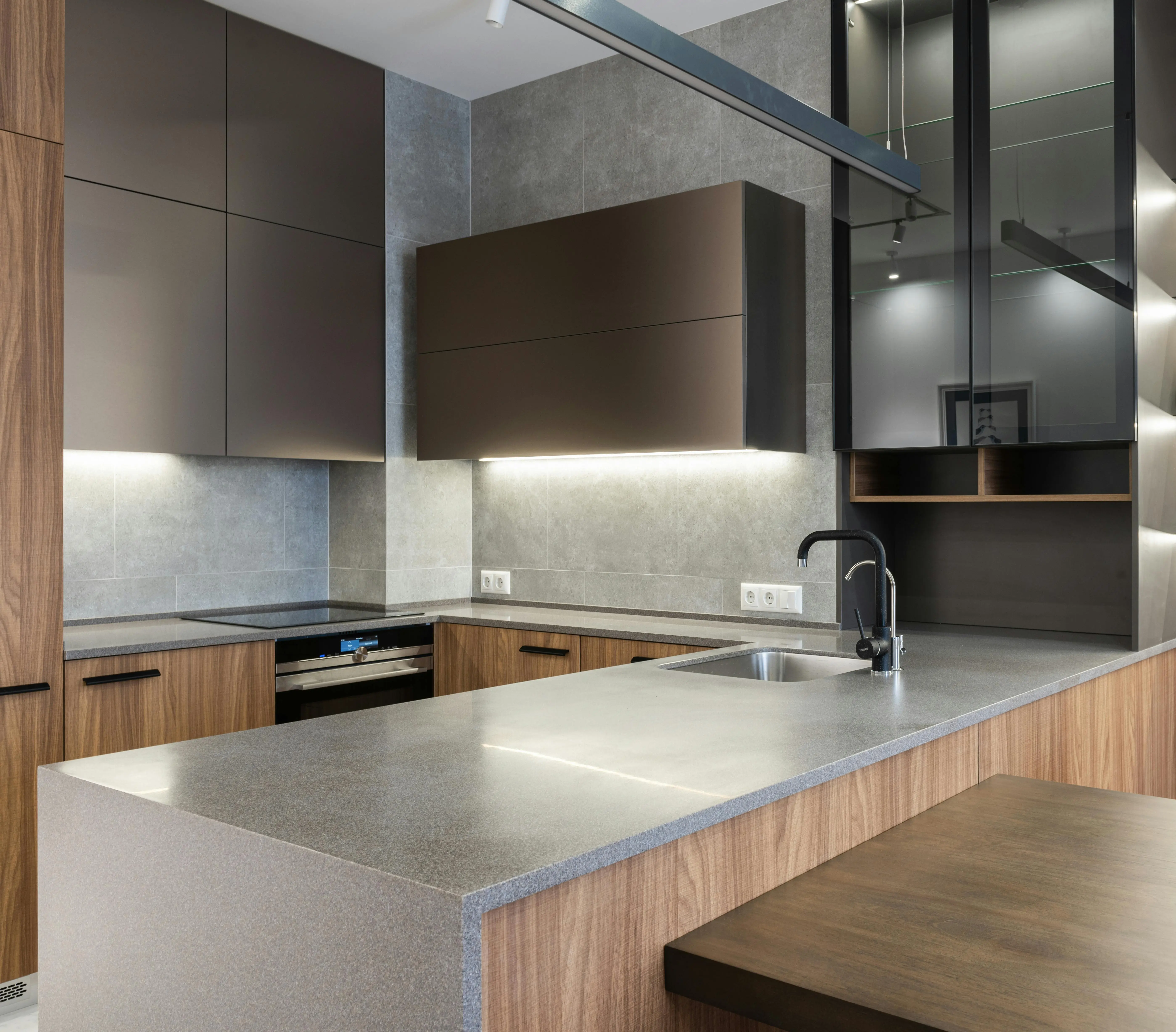
The application of grey paint varies significantly from room to room, largely due to the differing functions and desired atmospheres of each space. What works well in a cozy bedroom might feel too cool or sterile in a bustling kitchen. For living rooms, which are often the heart of the home, a versatile and welcoming grey is usually preferred. Look for warmer greys or ‘greige’ tones that have subtle brown or green undertones. These shades create an inviting backdrop that allows your furniture, artwork, and personal touches to shine without being overwhelmed. Popular choices like Sherwin-Williams’ Accessible Beige (a true greige) or Benjamin Moore’s Revere Pewter offer that perfect balance of warmth and sophistication, making them some of the best grey paint colors for communal areas. They provide a neutral canvas that pairs beautifully with a wide array of accent colors, from vibrant blues to soft corals.
In bedrooms, where relaxation and tranquility are paramount, cooler greys with soft blue or lavender undertones can be incredibly effective. These shades promote a sense of calm and serenity, fostering a peaceful environment conducive to sleep. Think about Benjamin Moore’s Marilyn’s Dress or Farrow & Ball’s Pavilion Gray. If you prefer a slightly warmer feel while maintaining a sense of calm, a light greige can also work wonders, making the room feel snug and inviting. The key is to avoid overly dark or intense greys in smaller bedrooms, as they can sometimes make the space feel oppressive. For kitchens and bathrooms, durability and brightness are often key considerations. Light to medium greys that have a crisp, clean feel are excellent. Greys with very subtle blue or green undertones can appear fresh and modern, complementing stainless steel appliances and white fixtures beautifully. Consider shades like Benjamin Moore’s Gray Owl or Light Pewter. These lighter greys also help to reflect light, which is particularly beneficial in kitchens that might lack abundant natural light, making the space feel larger and more hygienic.
Hallways and entryways benefit from greys that are both practical and aesthetically pleasing. These transitional spaces should feel welcoming but also be able to withstand higher traffic. A medium-toned grey paint can mask scuffs and marks more effectively than very light shades. Opt for a grey with a touch of warmth to prevent the space from feeling cold or stark. Something like Sherwin-Williams’ Repose Gray or Benjamin Moore’s Edgecomb Gray offers a foundational neutral that ties the rest of your home’s color palette together seamlessly. For home offices, consider a grey that promotes focus and calm without being too dull. Greys with slight green undertones can be surprisingly invigorating, creating an atmosphere that is both professional and stimulating. Always remember to sample your chosen grey in each specific room, allowing the natural and artificial lighting conditions to reveal its true character. This crucial step will prevent disappointment and ensure your selected grey harmonizes perfectly with the unique environment of each space.
Popular and Best Grey Paint Colors to Consider
Navigating the sheer volume of grey paint options can be daunting, but a few shades have consistently risen to the top as industry favorites for their versatility and enduring appeal. When discussing the best grey paint colors, certain names frequently come up, lauded by designers and homeowners alike. One such star is Benjamin Moore’s Revere Pewter HC-172. This iconic greige masterfully blends grey and beige, offering significant warmth without leaning too heavily into brown. Its incredible adaptability makes it suitable for almost any room and complements a vast range of décor styles, from traditional to contemporary. It’s particularly fantastic in open-concept spaces where it effortlessly connects different areas of the home, proving itself as a true chameleon among neutrals.
Another highly celebrated shade is Sherwin-Williams’ Repose Gray SW 7015. Touted as a true neutral grey, it possesses subtle warm undertones that prevent it from appearing cold or sterile. It features a touch of green that often emerges in brighter light, giving it a refreshing quality. Repose Gray is incredibly popular for living rooms, studies, and bedrooms, creating a serene and sophisticated backdrop. Its ability to pair well with both cool and warm accents makes it a go-to for those seeking a modern yet inviting grey. Meanwhile, for those who prefer a crisper, cooler grey, Benjamin Moore’s Gray Owl OC-52 is an excellent choice. It has a slight green-blue undertone that gives it a fresh, airy feel, particularly in rooms with ample natural light. It’s a favorite for bathrooms, kitchens, and contemporary spaces where a clean, bright aesthetic is desired, making light fixtures and white trim pop beautifully.
If you’re leaning towards a darker, more dramatic grey paint, Sherwin-Williams’ Urbane Bronze SW 7048, while technically a warm bronze-grey, serves as an outstanding dark neutral. Named Color of the Year in 2021, it offers a sophisticated, earthy feel, making a powerful statement. It’s ideal for accent walls, cabinetry, or even an entire room where a moody, cocoon-like atmosphere is sought. For a classic, elegant dark grey, Benjamin Moore’s Chelsea Gray HC-168 is a timeless choice. It’s a rich, deep grey with warm undertones that makes it feel grounding and luxurious. Lastly, for a barely-there, almost-white grey that still offers more depth than pure white, consider Farrow & Ball’s Pavilion Gray No. 242. This light shade is incredibly versatile, adding a soft, ethereal quality to any space without feeling dull. When evaluating these options, always remember to sample them in your own home. Paint large swatches on several walls and observe them throughout the day to see how different lighting conditions affect their appearance and allow their unique undertones to reveal themselves. This is the single most important step to picking the perfect grey for your haven.

Grey Paint in Modern Home Decor Trends
Grey paint isn’t just a classic choice; it’s also at the forefront of contemporary home decor trends, evolving to meet the demands of modern aesthetics. Its adaptability allows it to slide seamlessly into various design styles, from minimalist to industrial, and from Scandinavian to Japandi. In minimalist interiors, grey acts as the ultimate neutral, providing a calm and uncluttered backdrop that allows carefully selected furniture and artwork to take center stage. Lighter, purer greys are often preferred here, contributing to an airy and expansive feel. The focus is on clean lines, functionality, and a sense of sophisticated simplicity, all beautifully supported by a crisp grey paint palette. This restraint in color highlights texture and form, creating spaces that are both serene and visually compelling.
For industrial-style homes, charcoal greys and concrete-inspired shades are invaluable. These darker, moodier greys evoke urban grit and pair perfectly with exposed brick, metal accents, and reclaimed wood. They create an intentionally raw yet refined atmosphere that is characteristic of loft living and converted factory spaces. The robust nature of dark grey makes it an ideal complement to the hard lines and utilitarian elements of industrial design, softening the edges while maintaining an authentic, edgy vibe. In Scandinavian design, which champions light, natural materials, and hygge (a sense of coziness), light to medium greys with subtle blue or green undertones are frequently used. These greys enhance the natural light, making spaces feel brighter and more open. They harmonise beautifully with blonde woods, white textiles, and pops of muted color, creating an environment that is both calming and inviting. The emphasis is on comfort, warmth, and a connection to nature, all of which are effortlessly facilitated by the right shade of grey paint.
The burgeoning Japandi trend, a fusion of Japanese minimalism and Scandinavian warmth, also leans heavily on greys. Here, greys are chosen for their ability to create serene, balanced spaces. They are often paired with natural wood finishes, simple furniture, and a restrained color palette, fostering a sense of harmony and understated elegance. Additionally, greys are prominent in monochromatic schemes, where different shades and textures of grey are layered to create depth and visual interest without introducing other colors. This sophisticated approach involves using varying tones of grey paint on walls, cabinetry, and textiles to construct a rich, multi-layered look that is anything but boring. The enduring popularity of grey in these diverse, modern trends underscores its incredible versatility and its capacity to transcend fleeting fads, cementing its status as a timeless and endlessly chic design choice.
Tips for Painting with Grey Paint Like a Professional
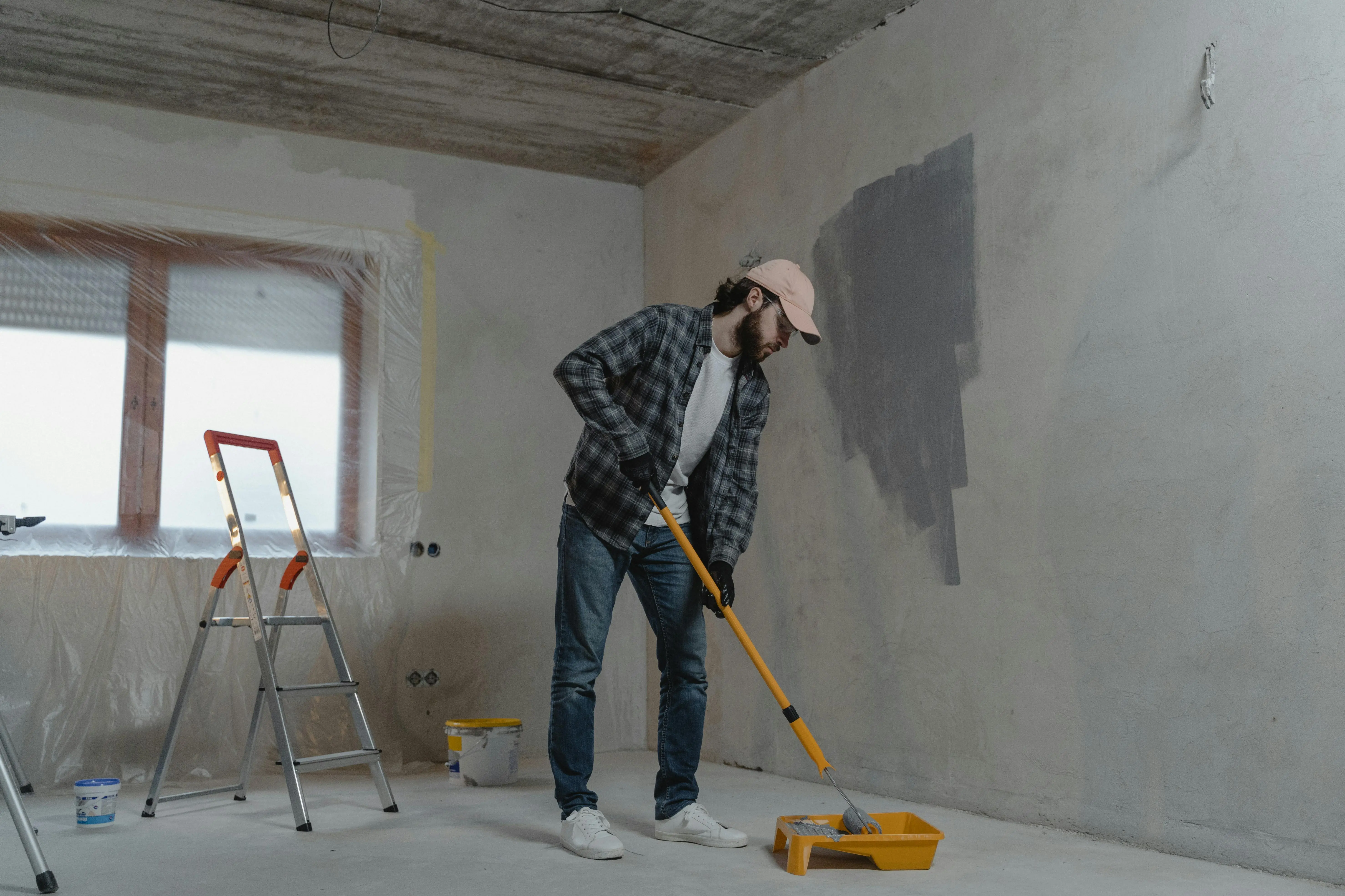
Achieving a professional finish with grey paint, or any paint for that matter, requires more than just picking a color and rolling it onto the wall. There are several crucial steps and considerations that can elevate your painting project from DIY to designer-level. The most vital tip, which cannot be overstated, is to always, always sample your paint. What looks perfect on a small chip in a brightly lit store can appear entirely different in your home’s unique lighting conditions. Purchase sample pots of your top three to five choices, and paint large swatches (at least 2’x2′) on various walls in the room you intend to paint. Observe these swatches at different times of day – morning, afternoon, and evening – and under both natural and artificial light. Pay close attention to how the undertones emerge and how the grey interacts with your existing flooring, furniture, and fabrics. This step alone will save you from potential disappointment and costly re-paints.
Proper surface preparation is another non-negotiable step. Even the best grey paint colors will look patchy and uneven on poorly prepped walls. Begin by cleaning your walls thoroughly to remove any dirt, dust, or grease. Use a mild detergent and water, then rinse and allow to dry completely. Repair any imperfections – nail holes, cracks, or dents – with spackle, then sand smooth until the surface is perfectly even. For glossy surfaces, a light sanding will help the new paint adhere better. Don’t skip the primer! A good quality primer provides a uniform base for your paint, ensures better adhesion, and helps to achieve true color rendition, especially when painting over a darker or very porous surface. It also reduces the number of coats of your chosen grey paint you’ll need, saving both time and money.
When it comes to application, use high-quality brushes and rollers. Cheap tools can leave streaks, shed bristles, and lead to an unprofessional finish. For walls, a 9-inch roller with a medium nap (3/8-inch) is generally suitable for smooth to lightly textured surfaces. For cutting in around edges, trim, and corners, a 2-2.5 inch angled brush is ideal for precision. Apply paint in thin, even coats rather than one thick coat. This prevents drips and allows for better adhesion and a smoother finish. Typically, two coats are needed for full coverage, but some deeper greys or those going over a very different color might require a third. Allow adequate drying time between coats, as specified by the paint manufacturer. Finally, consider the paint finish. Matte or flat finishes conceal imperfections well and offer a sophisticated, velvety look, often favored for walls. Eggshell or satin finishes are more durable and offer a slight sheen, making them ideal for high-traffic areas like hallways and kitchens where washability is important. Matching the finish to the function of the room is key to both aesthetics and longevity.
Enhancing Your Space with Grey Paint Accents
Utilizing grey paint extends far beyond just covering entire walls; it can be incredibly effective when used strategically for accents, adding depth, dimension, and architectural interest to a room. This approach is particularly powerful when you want to introduce grey in a subtle way or to highlight specific features within your home. One popular method is painting an accent wall. A feature wall in a deeper, more saturated grey can ground a room, draw the eye, and provide a dramatic backdrop for artwork or a key piece of furniture, such as a bed or a fireplace. Imagine a rich charcoal grey behind a light-colored sofa, immediately making the space feel more sophisticated and purposefully designed. This can be one of the best grey paint colors to create a focal point without overwhelming the entire room, especially if the other walls are a lighter, complementary shade or even white.
Another excellent way to incorporate grey accents is through cabinetry. Painting kitchen cabinets, bathroom vanities, or built-in shelving units in a beautiful shade of grey can instantly update a space and give it a bespoke, high-end feel. Light greys can make a kitchen feel bright and airy while providing more visual interest than plain white. Darker greys, on the other Benches or islands in a bolder grey paint can serve as anchors in an open-plan living area or kitchen, creating a sense of separation and style. This provides an opportunity to experiment with a deeper or more nuanced grey without committing to it on all walls, perfect for testing out the impact of a strong color. For example, a deep blue-grey on lower cabinets paired with white uppers can create a balanced and very stylish kitchen.
Trim and interior doors also offer fantastic opportunities for grey accents. While white trim is traditional, painting your trim a light grey can add a contemporary twist and a softer transition between walls and architectural details. Conversely, painting interior doors in a dark grey provides a striking contrast against lighter walls, adding a touch of drama and elegance. This technique works exceptionally well in hallways, creating visual punctuation and guiding the eye through the space. Even smaller architectural details, like window frames or ceiling beams, can benefit from a touch of grey to make them stand out. By carefully selecting where and how you apply grey paint as an accent, you can create a home that feels thoughtfully curated and stylish, showcasing the immense versatility of this timeless hue without a full-room commitment. These strategic touches can elevate the entire aesthetic of your home, proving that sometimes, less is indeed more.
FAQs About Grey Paint
What are the actual best grey paint colors for a north-facing room?
For north-facing rooms that tend to receive cooler, indirect light, it’s generally best to choose warmer grey paint colors. These often have subtle brown, green, or even purple undertones which help to counteract the cool light and prevent the room from feeling too stark or cold. Greige shades like Benjamin Moore’s Revere Pewter or Sherwin-Williams’ Agreeable Gray are excellent choices as they bring warmth to the space. Alternatively, greys with a very slight green undertone like Sherwin-Williams’ Repose Gray can also work well, offering a balanced warmth. Always sample several options on the walls to see how they look throughout the day.
Can I mix different shades of grey paint in one room?
Absolutely! Mixing different shades of grey paint in one room can create depth, texture, and visual interest, making the space feel more sophisticated and layered. You can use a lighter grey on the walls and a slightly deeper grey on an accent wall, or even paint the ceiling a pale grey to add a softer feel than stark white. Varying shades of grey can also be introduced through textiles, furniture, and accessories to create a cohesive monochromatic scheme. Ensure the greys you choose have compatible undertones to maintain harmony.
How do I make a grey paint room feel more inviting and less sterile?
To make a grey paint room feel more inviting, focus on incorporating elements that provide warmth and texture. Introduce warm wood tones through furniture, flooring, or decorative objects. Add layers of soft textiles like thick rugs, plush throws, and decorative pillows in complementary colors such as creams, blues, or even soft yellows. Metallic accents in gold or brass can also add a touch of warmth and luxury. Ensure good lighting with warm-toned bulbs and consider adding plants to bring life and natural organic elements into the space. A strategically chosen accent color can also prevent a grey room from feeling too sterile.
Is grey paint still a trending color, or is it outdated?
Grey paint remains a timeless and highly popular color, evolving with design trends rather than becoming outdated. While some extremely cool or sterile greys from peak popularity might feel less current, the broader spectrum of greys, particularly warmer greys, greiges, and those with nuanced undertones, continues to be extremely relevant. Its enduring versatility allows it to adapt to various styles, from modern minimalist to classic traditional, ensuring its place as a foundational neutral in interior design. The key is choosing the right shade and understanding its undertones for a contemporary look.
What accent colors pair best with grey paint?
Grey paint is incredibly versatile and pairs well with a wide range of accent colors, allowing for diverse aesthetic expressions. For a calm and sophisticated look, consider muted blues, greens, and soft blush pinks. For a bolder statement, vibrant yellows, deep mustards, rich emerald greens, or navy blues can provide striking contrast. Earth tones like terracotta, warm browns, and rust also harmonize beautifully with grey, especially greiges. Metallics such as gold, brass, and copper can add a touch of luxury and warmth. The best accent color will ultimately depend on the specific undertones of your grey and the overall mood you wish to create in the room.
Conclusion: Embracing the Endless Possibilities of Grey Paint
As we’ve explored the expansive and often nuanced world of grey paint, it’s clear that this seemingly simple color is anything but. From its subtle undertones that can dramatically shift its appearance to its remarkable ability to seamlessly integrate into virtually any design aesthetic, grey stands as a testament to timeless sophistication and versatility. We’ve delved into how to choose the right shade for different rooms, highlighted some of the best grey paint colors lauded by professionals, and shared insights into using grey effectively in modern decor trends. The journey of selecting and applying grey paint is one that requires thoughtful consideration, from understanding the impact of light to meticulous surface preparation, but the rewards are immeasurable – a home that feels effortlessly stylish, comfortable, and uniquely yours.
The power of grey lies in its ability to provide a calm, elegant foundation that allows other elements in your room to truly shine. It can be a canvas for vibrant artwork, a backdrop for luxurious textiles, or a quiet companion to natural wood and metallic accents. By paying close attention to undertones and sampling different shades in your home’s unique lighting, you empower yourself to make informed decisions that will transform your space. Remember, grey isn’t just a color; it’s a mood, a statement, and a pathway to creating interiors that resonate with your personal style. So, don’t shy away from experimenting with this magnificent hue. Embrace the endless possibilities that grey paint offers and discover how it can elevate your home into a sanctuary of beauty and calm. Unleash your inner designer with a confident stroke of grey, and witness the remarkable transformation unfold.